Industry
E-commerce
Role
UI/UX Designer
Tools
Figma
2025
About the project
Freshfruit is an e-commerce platform that delivers seasonal, organic fruits directly to customers. This case study showcases my role as a UI/UX designer in creating a seamless, visually appealing, and conversion-focused user experience — from research and wireframing to final design.
My role
UX Research & Competitive Analysis
User Flow & Wireframes
High-Fidelity UI Design (Mobile & Desktop)
Design System Creation
Interaction Prototyping in Figma
User Flow & Wireframes
High-Fidelity UI Design (Mobile & Desktop)
Design System Creation
Interaction Prototyping in Figma
Challenge
Many online fruit shops suffer from outdated interfaces, unclear product presentation, and poor mobile usability. The goal was to design an intuitive and trustworthy shopping experience that:
Research & Insights
I analyzed 3 real-world fruit delivery shops and conducted informal interviews with 5 frequent online grocery shoppers. The goal was to identify pain points, expectations, and opportunities for a better shopping experience.
“I wish I could just filter by ‘seasonal’ or ‘organic’ and skip the rest.”

10+
Insights
“Give me a ready-made fruit mix—like something for smoothies or breakfasts.”

“I got all the way to checkout before finding out some items were unavailable.”

5
Interviews
“Photos totally sell it. If the fruit looks great, I’m more likely to buy.”

User Goals 🎯
These goals reflect key user needs and priorities.
1
Discover what suits their needs (e.g., seasonal, organic, local) without having to scroll endlessly
2
Find clear information about the origin, condition, and availability of the fruits before making a purchase
3
Have a frustration-free experience — from browsing to checkout — with intuitive filters and minimal surprises
User flow
🧩 UX Focus
The flow prioritizes ease of navigation, minimal steps to conversion, and meaningful user touchpoints — supporting both first-time visitors and loyal customers.
The flow prioritizes ease of navigation, minimal steps to conversion, and meaningful user touchpoints — supporting both first-time visitors and loyal customers.
Typography & Colors
#E06546
#F6F7F2
#747637
#FFCB2F
Typography
Montserrat
123
Main font
abcdefghigklmn
opqrstuvwxyz
12345678890
opqrstuvwxyz
12345678890
Aa
Regular
Bb
Medium
Cc
SemiBold
Dd
Bold
Wireframing
This wireframe defines the core structure of the Freshfruit shop platform — from homepage to checkout — balancing clarity, speed, and a smooth user experience.
Decktop Design
1440 px
HOME PAGE
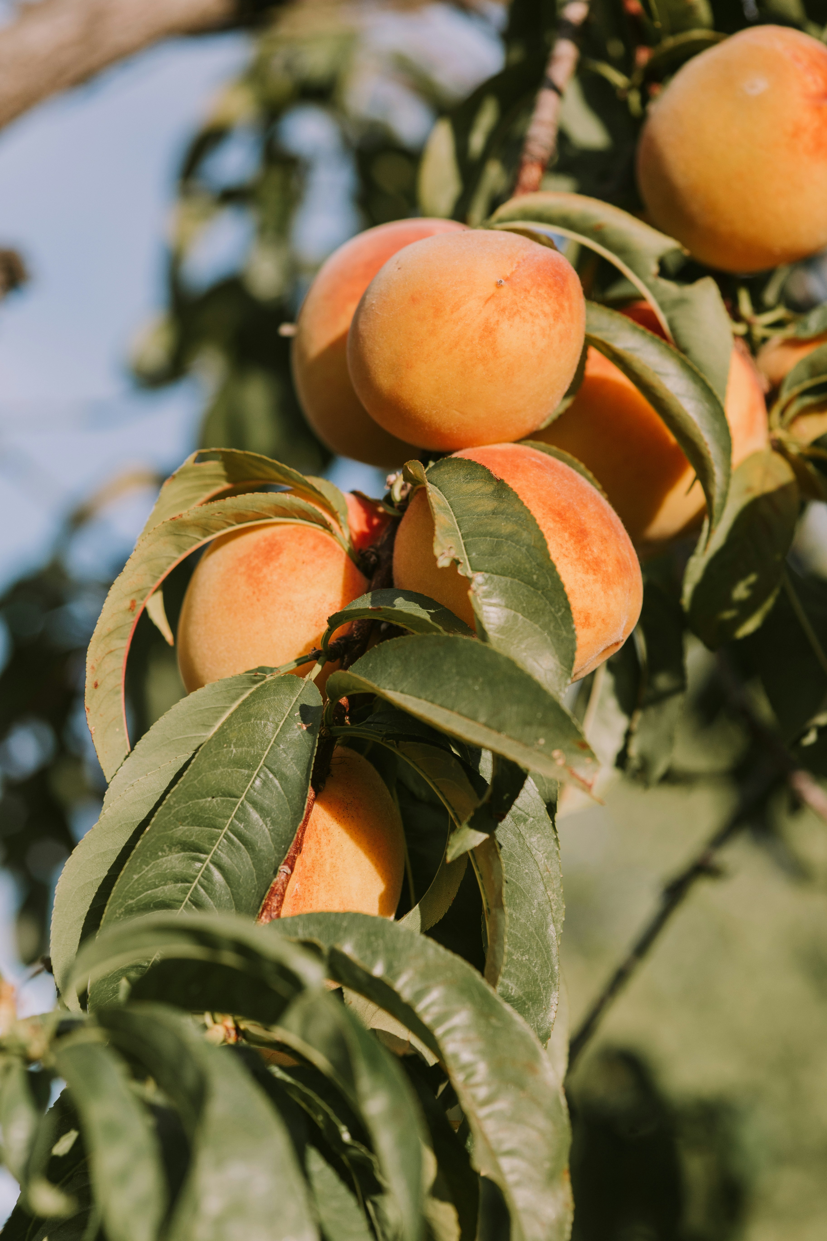
The hero section was designed to instantly communicate the brand's core values. I used bold typography, color contrast, and real fruit imagery to grab attention and build trust.
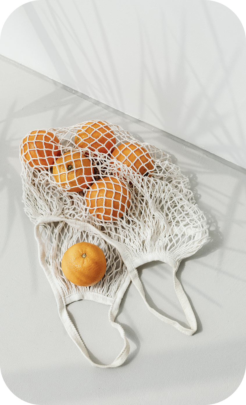
Smart filters on the homepage support a user-centered approach to faster discovery, allowing shoppers to browse by what matters most — seasonality, origin, or curated sets. This is paired with packaging section, highlights the brand’s sustainable values. Featuring reusable cotton bags with clean, aspirational photography not only reinforces trust, but also inspires eco-conscious habits through subtle visual storytelling.
User trust is further reinforced with a testimonial slider, showcasing real customer feedback from wellness-focused personas.
To keep users engaged beyond shopping, I integrated a blog preview with curated articles. These support the brand mission and position the shop as a source of wellness inspiration.
CATALOG
The product catalog is designed to feel clean, scannable, and easy to explore. Smart filters at the top allow users to instantly sort fruits by category — Local, Exotic, Seasonal, or curated Smart Picks — reflecting real-world shopping behaviors. This approach reduces decision fatigue and helps users find what they need faster, while tags like “Sale” or “Detox” add context at a glance without overwhelming the layout.
PRODUCT PAGE
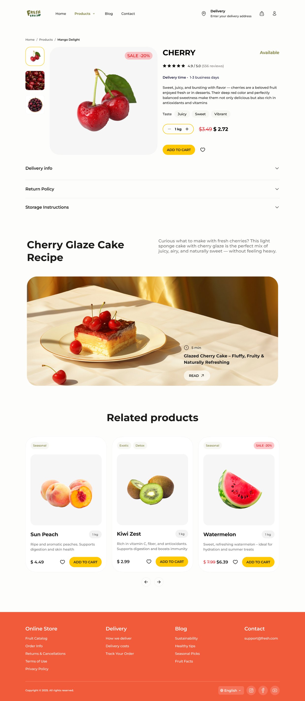
Blog section helps customers visualize how they can use the product in their kitchen, making the purchase feel more inspiring and practical.
Showing related products not only enhances the user experience but also encourages higher basket value through easy one-click additions.
BLOG
The blog section serves as an extension of the shopping experience, designed to inspire, educate, and support healthy lifestyle choices. With a mix of tips, fruit facts, and recipes, users can discover how to use the products they buy — right in their own kitchen. Each article page continues the user journey by suggesting curated products related to the content, turning inspiration into action and seamlessly bridging editorial and commerce.
THANK YOU
FOR WATCHING
FOR WATCHING