Native App | Redesign
Industry
E-commerce
Role
UI/UX Designer
Tools
Figma
Skills
Wireframing
Prototyping
User Testing
Visual Design
Context
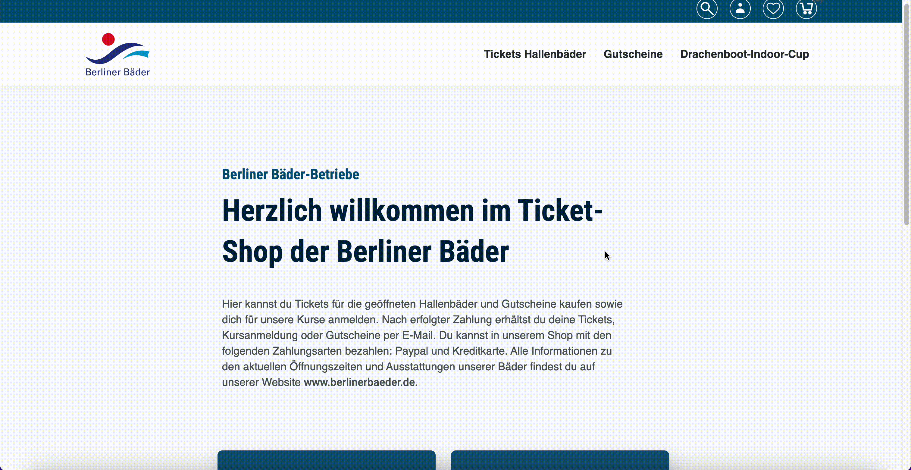
Berliner Bäder is an online shop that provides access to tickets and memberships for swimming pools across Berlin. The current website requires a complete redesign to deliver a modern e-commerce experience. It lacks visual hierarchy, high-quality imagery, and an intuitive user experience for accessing essential features.
Key Features
● Purchase Tariffs/Vouchers
● Event Monitoring
● Event Registration
● Event Monitoring
● Event Registration
Users
● General Users (18+): Individuals seeking a quick and easy way to purchase swimming pool tickets, avoiding long queues.
● Teachers: Educators registering school classes for participation in swimming competitions.
● Companies (Participants): Employers interested in participating in sports events.
● Companies (Recruiters): Employers exploring potential future trainees at sports events.
● Teachers: Educators registering school classes for participation in swimming competitions.
● Companies (Participants): Employers interested in participating in sports events.
● Companies (Recruiters): Employers exploring potential future trainees at sports events.
Current Web Design
Poor navigation
Outdated design
low-quality and uninviting images
Content Structure
Form Labels
Visual Accessibility
Registration process for events is unclear
and complex
and complex
Low readability
01 User Flow
To make it easy and intuitive for users to reach their goals in the app, I captured the necessary steps and showed them in User Flows at the beginning. The following tasks can be completed by the user when using the app:
Flow 1. Create a profile
Flow 2. Buy a tariff/ voucher for friends or family
Flow 3. Register for pool events/competitions for school classes or employers
Flow 1. Create a profile
Flow 2. Buy a tariff/ voucher for friends or family
Flow 3. Register for pool events/competitions for school classes or employers
Splash screen
Log In or Sign Up
Home
Do you have an account?
Yes
No
Sign Up
Sign In
Fill personal info
Register
Success!
Events
Register as viewer
Register as participant
Сatalog
Choose an item
Add to cart
Cart
Check out
Check out
Choose payment variant
Input payment info
Confirm
03 Mid-fid wireframes
Shopping
Events
Profile
Shopping
Events
Profile
Gifts
Your cart (2)
Add more items
Select a time
After mapping out the flow, I progressed to creating mid- to high-fidelity wireframes using a mobile-first approach, focusing on simplicity and intuitive navigation. The goal was to design clear, user-friendly screens by reducing complexity and ensuring easy access to key features
Home
My tickets
Lorem ipsum dolor sit amet consectetur.
Lorem Impsum
9:41
9:41
Home
My tickets
Tariff name
Lorem ipsum dolor sit amet, consectetur adipiscing elit ut labore et dolore
Buy
Shopping
Tariffs
Other
Lorem Impsum
Lorem ipsum dolor sit amet, consectetur adipiscing elit ut labore et dolore
Buy
Lorem Impsum
Lorem ipsum dolor sit amet, consectetur adipiscing elit ut labore et dolore
Buy
Lorem Impsum
Lorem ipsum dolor sit amet, consectetur adipiscing elit ut labore et dolore
Buy
Lorem Impsum
Lorem ipsum dolor sit amet, consectetur adipiscing elit ut labore et dolore
Buy
9:41
Lorem ipsum
-
1
+
Lorem
ipsum
ipsum
-
1
+
Total
6,80 €
Continue with Apple Pay
Other method
08:00 am
14:00 pm
10:00 am
16:00 pm
12:00 am
18:00 pm
Next
Participant
Viewer
9:41
15
Select the amount of participants
Next
Participant
Viewer
9:41
04 User Testing
After developing the high-fidelity prototype, I conducted usability testing with five users. The feedback primarily focused on the UI design. Below is a summary of their input and the changes I implemented based on their suggestions. Here is some of them:
Comments
“I did not understand what the "skip" will accomplish. somehow because of empty space around it grabs my attention.”
“I am a little bit confused about how to move on. If I have an account, where should I click? These options are not clear. Three buttons with same color confuses me.”
Before
After

Berliner Bäder
9:41
Skip registration
Welcome to Berliner Bäder
Continue with Google
Continue with Email
Already registered? Sign in
Comments
“What is the search bar on the top for?”
“In my opinion so bright red doesn't really fit the color palette.”
“Even though I know it is a button on the item card, I feel sth is missing.”
“It is hard to read. More contrast would be better.”
Before
 Search
Tariff
Tariff
Home
Shopping
My tickets
Events
Profile
Search
Tariff
Tariff
Home
Shopping
My tickets
Events
Profile
3,40 €
3,40 €
9:41
Basic tariff
Valid weekdays, excluding public holidays, 10:00 a.m. to 3:00 p.m.
3, 50 €
2 €
2 €
Main tariff
Valid all day Monday to Sunday and on public holidays from the time the pool opens.
5, 50 €
3, 50 €
3, 50 €
Evening tariff
Valid Monday to Friday, excluding public holidays, for pool use until 8 p.m.
3, 50 €
Morning tariff
Valid Monday to Friday from the time the pool opens until 10:00 a.m.
3, 50 €
After
I chose to maintain the dark background to enhance readability and create a stronger visual contrast.I got rid of search bar at the top as there are not many items in the shop and it takes a lot of space on the top.
04 UI & Style Guide
 Typography
Iconography
Main UI Elements
Typography
Iconography
Main UI Elements
 Basic
Basic
tariff 2 €
After wireframing I created a look & feel for the app and added branding elements. I aimed to create a sense of modernity and reliability, while also evoking feelings of relaxation and wellness through the style guide
I used elegant and modern sans-serif font that is easy to read, it has a clean and minimalistic look.
Montserrat
Semi Bold / Medium / Regular
Name
Font
Size
Heading1
Semi Bold
48 px
Heading2
Semi Bold
32 px
Subh1
Semi Bold
24 px
Subh2
Semi Bold
20 px
Label1
Semi Bold
16 px
Body1
Semi Bold
14 px
Body2
Medium
14 px
Label2
Regular
14 px
Label3
Regular
12 px
Label4
Medium
10 px
Colors
Primary Solid
HEX
#00CCE5
100%
Primary Linear
HEX
#124349
#00D9F3
100%
Background Secondary
HEX
#1A1A1A
100%
Background Primary
HEX
#000000
100%
Text Primary
HEX
#FFFFFF
100%
Text Secondary
HEX
#808080
100%
System One
HEX
#636366
100%
System Two
HEX
#787880
24%
Disabled
HEX
#182A2C
100%
Text fields
Input
Input
Input
XXX XXX XX XX
Card item
Basic tariff
Valid weerdays, excluding public holidays, 10:00 a.m. to 3:00 p.m. Valid weekdays
Buy
tariff 2 €
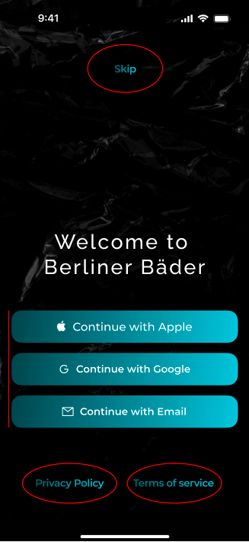
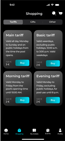
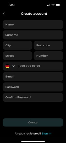
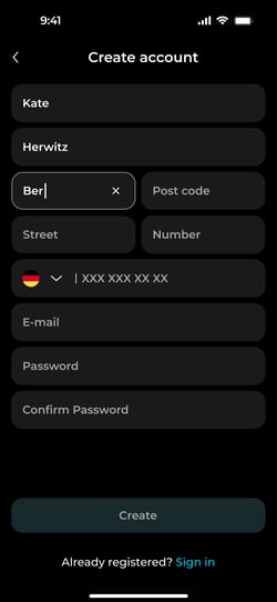
05 FInal Visual Design
Welcome screens
Create account screens


Home page + Shopping
Registration for the event
Thanks for watching.